|
The lack of a blog post for the past 2 months (!) owes to my participation in the Inorganic Block with the first year WUDPAC (Winterthur/University of Delaware Program in Art Conservation) masters students. In block, the students (and I) learned more about metals, stone, ceramic, and glass conservation. I also subjected them to 3 hours of Delft tile history, manufacture, and conservation. In the meantime, I've still been treating and researching the tiles. Today's blog post is about my months-long struggle to identify the iconography of this unique tile and color match its gray background.
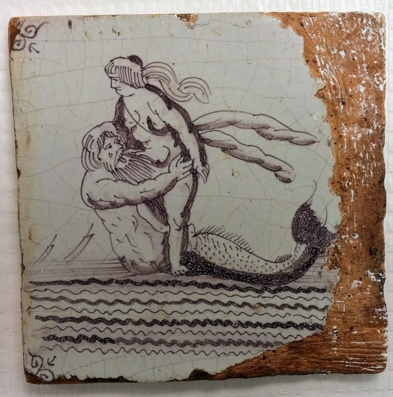
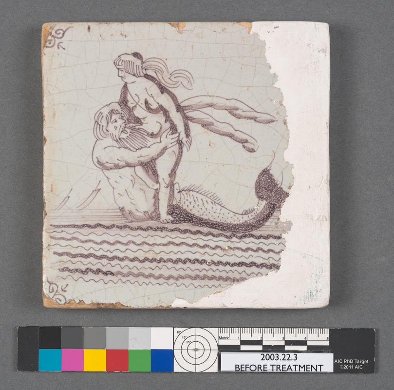
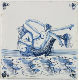
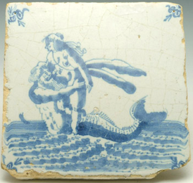
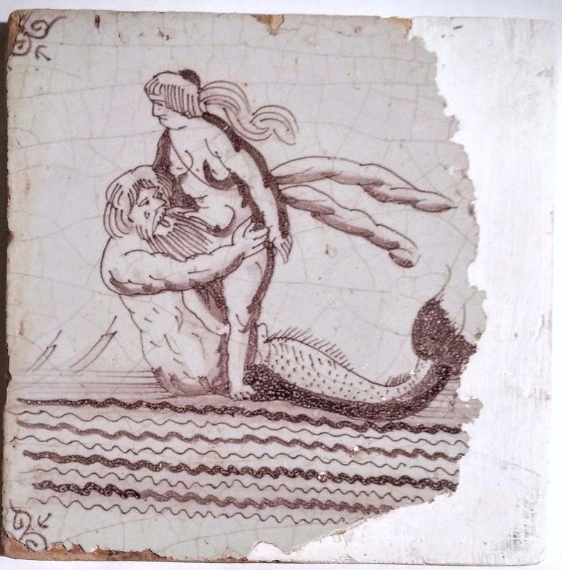
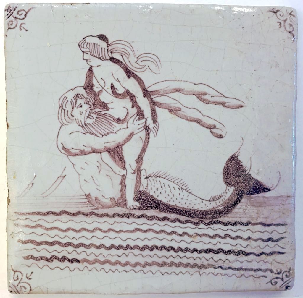
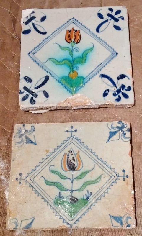
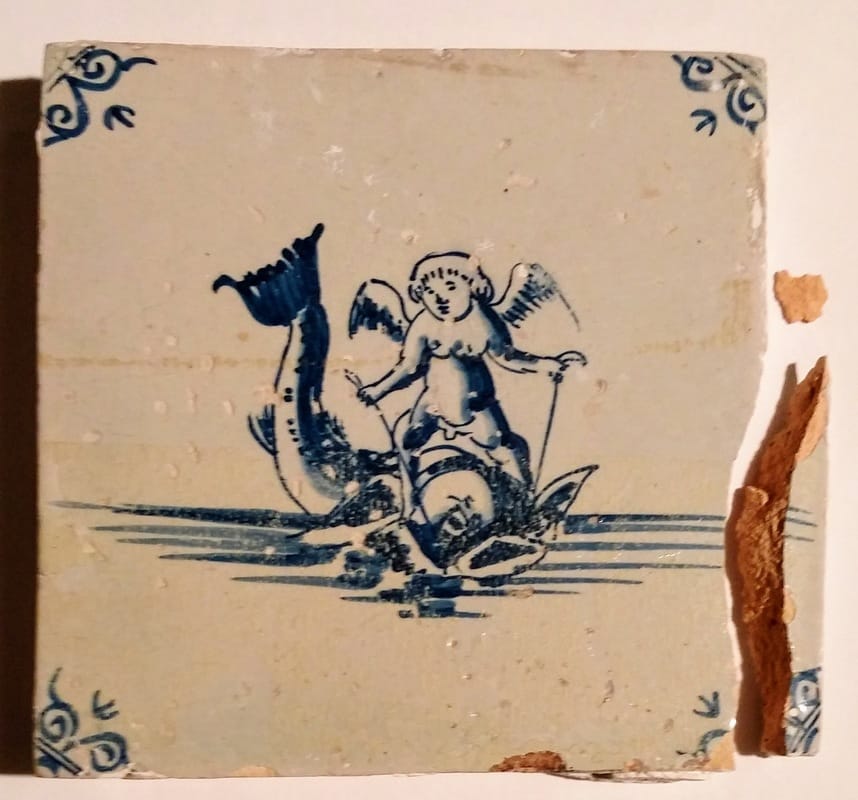
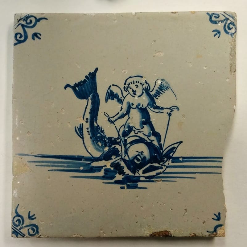
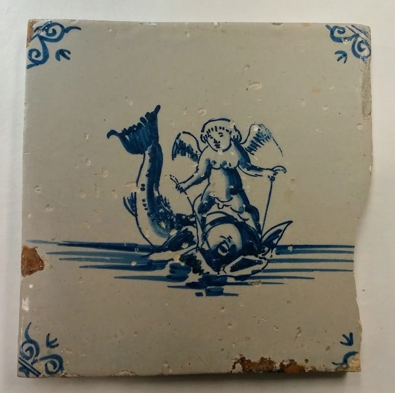
The tile above was probably manufactured somewhere between 1600 and 1700 in the Netherlands. An artist painted the decoration onto the unfired tin-glazed surface with a manganese glaze, which turned purple when fired. While I know how the tile was made, its iconography is more elusive. Winterthur's database lists the tile as "merman grasping a nude woman trailing a scarf." Other similar tiles are listed by dealers and museums as "Merman and Fortuna" (below left) or simply "Neptune" (below right). While sea monsters are a common motif on Delft tiles, this particular decoration is relatively rare.
When I searched for inspiration sources in other media, I quickly realized that the tile is actually meant to represent a merman, or triton and a sea nymph, or nereid.  Not this type of merman. Examples of tritons abducting nereids in art range from a niello print (made with silver, copper, and lead sulfides) from Renaissance Italy to a bronze fountain at the Mirbach Palace in Bratislava. 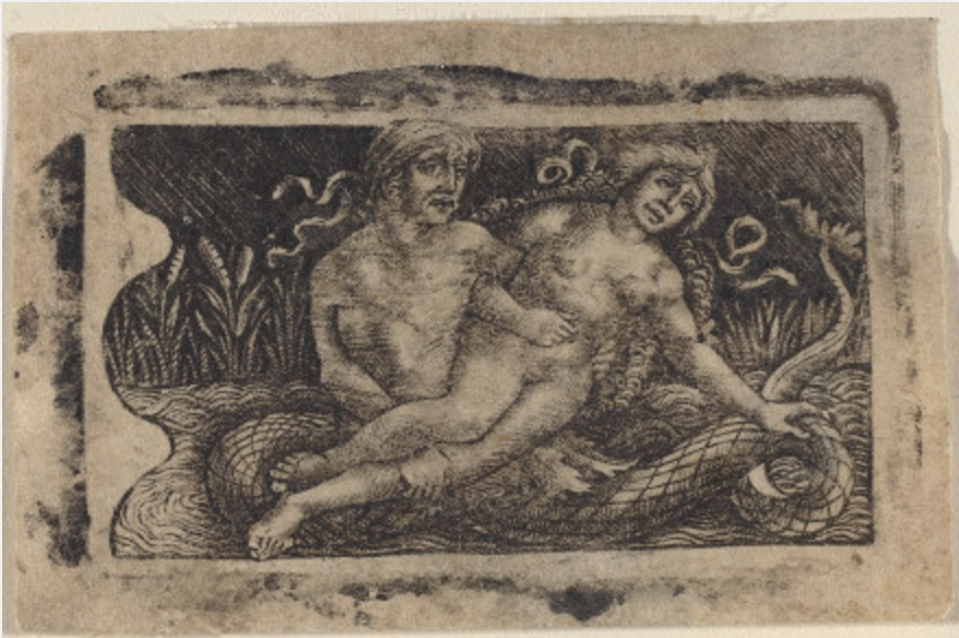 Francesco Francia or Peregrino da Cesena, Triton and Nymph, c. 1490/1510, Niello print, National Gallery of Art, 1943.3.6683  Triton and nymph fountain, Mirbach Palace, Bratislava However, while the nereid on this tile does not look particularly happy, she appears to be standing on the back of the triton rather than being carried off. The mosaic below from the Bardo National Museum in Tunis depicts sea nymphs riding on the backs of tritons and other sea creatures. They all have flowing scarves similar to the one worn by the nereid on the Delft tile. There is also a reference in Dionysiaca, an epic poem by Nonnus, to Thetis, the nereid mother of Achilles, riding into battle "on the green hip of a Triton with broad beard" (6. 257 ff). Perhaps the nymph on Winterthur's tile is wearing her battle face. 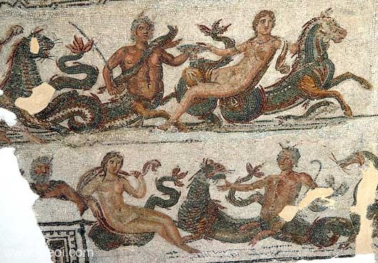 Mosaic depicting sea nymphs riding on the backs of tritons and other sea creatures, Bardo National Museum, Tunis, Imperial Roman Once I'd discovered what the tile was actually depicting, it was time to start treatment! Treatment Process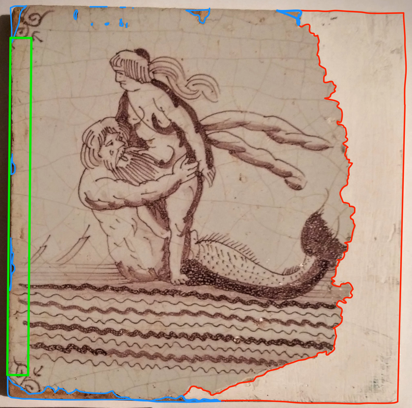 The tile's major condition issues include:
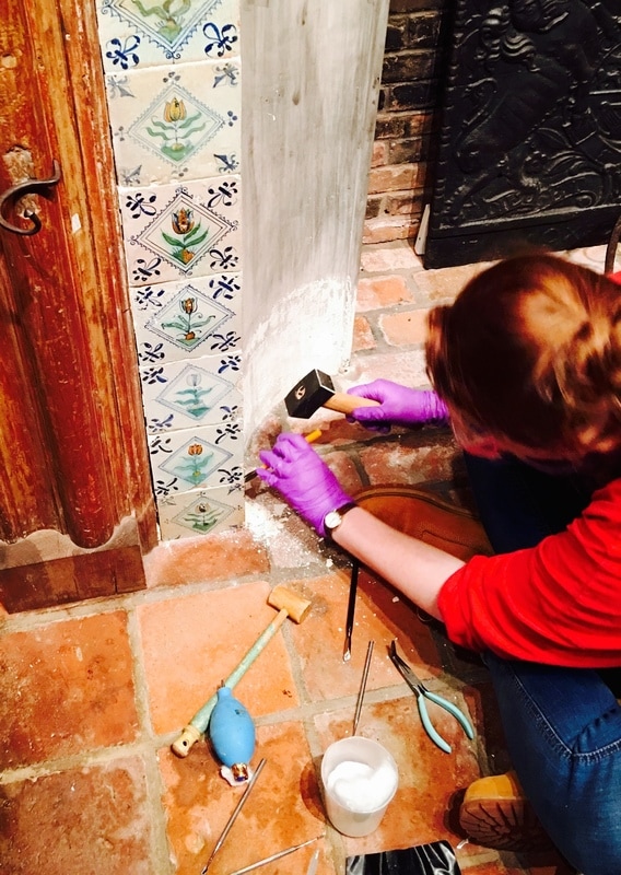
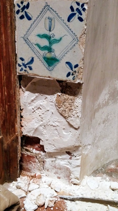
 I started off by removing the plaster fill. Once removed, I saw that the previous restorer had keyed, or carved, into the ceramic body in order to make the plaster adhere better. This is something that modern conservators do not do, because it damages the original material. Bits of plaster was also stuck in all the grooves and had to be painstakingly removed under a microscope. Stain ReductionThe staining along the proper right edge of the tile did not respond to cleaning with water and other common conservation solvents like acetone. Because of this, I conducted cleaning tests with chelators, or materials that remove heavy metal staining. 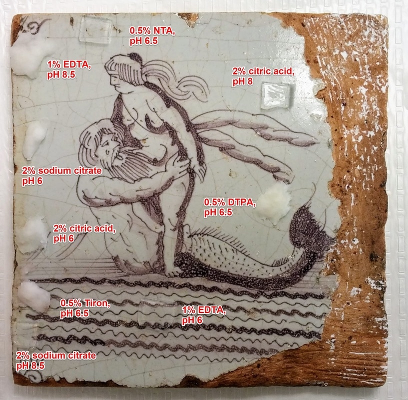 Conducting stain reduction tests of various chelators with either Filter Flockenmasse (paper pulp, white material) or 1% agarose gel (polysaccharide from seaweed). 1% EDTA (disodium ethylenediaminetetraacetic acid) in deionized water buffered to a pH of 8.5 with sodium borate was determined to be the most effective chelator for this particular stain. The solution was applied to the proper right edge of the tile in 5% agarose gel to reduce the yellow stained area (below). 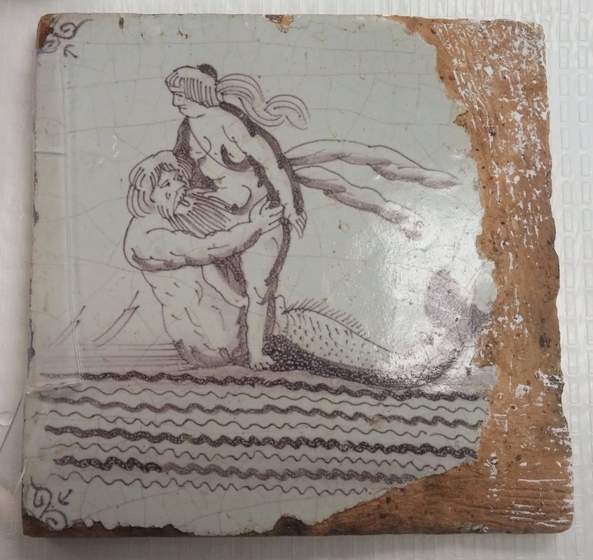 After two rounds of application of a chelator, carbamide peroxide in laponite gel was applied as a combination bleach/rinse over a Japanese tissue paper (Gampi Usuyo) barrier and allowed to dry. This process ensures that no acid is left on the surface of the tile, as it could potentially harm the ceramic. InpaintingThough the stain was not completely removed, it was reduced enough to not distract from the decorative quality of the tile (below). 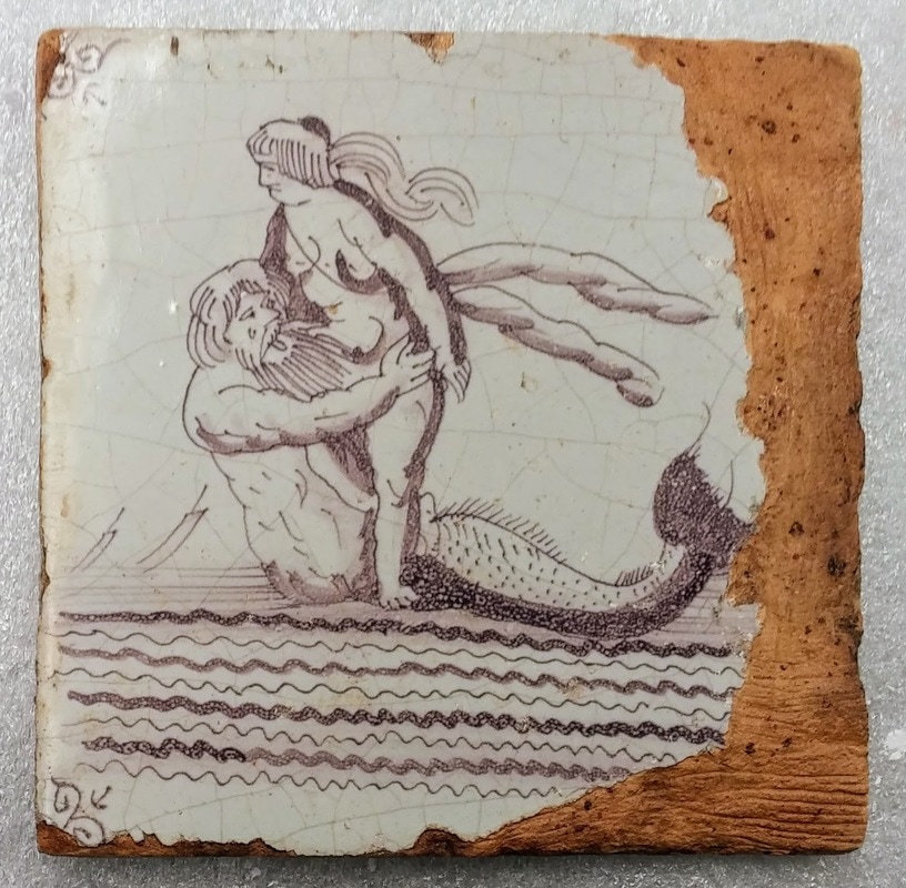 I filled the areas of lost glaze with Flugger and began the arduous process of in-painting. As I've said my previous blogpost about inpainting, sometimes you magically match the color right away. Sometimes, though it can take weeks to get the color right. That was the case with this tile... I started with a base color that was relatively close to the color of the background. 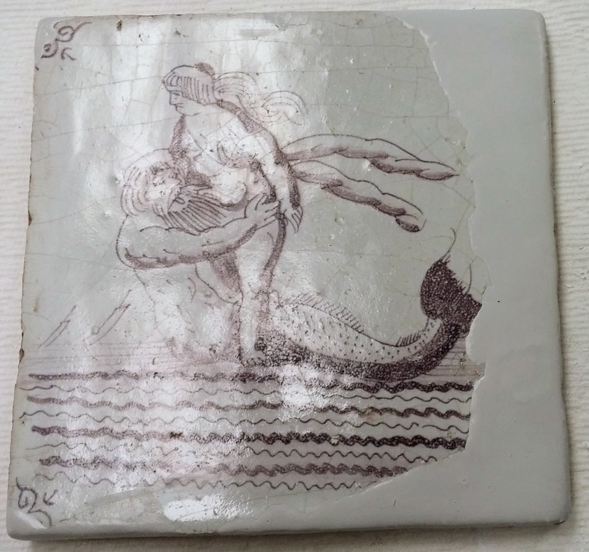 I then began inpainting the merman's tail and the waves with acrylic paint, using the tile from the Museum of London in the previous section as an example. I also attempted to draw in the crazing lines...to moderate success. Even using my smallest brush, the lines appeared too wide. 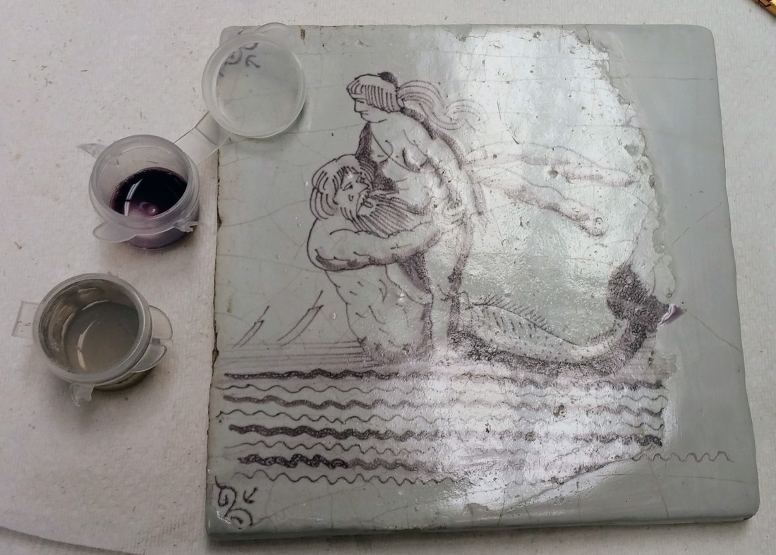 I was unhappy with how much the fill stood out, so I decided to try and fix part of my in-painting... 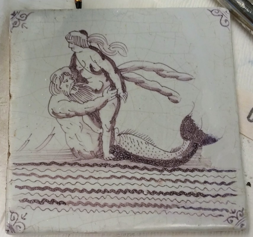 ...and again... 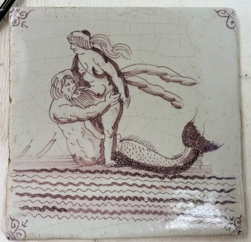 On my sixth attempt, I finally decided to just rip out the parts I wasn't happy with and start over. 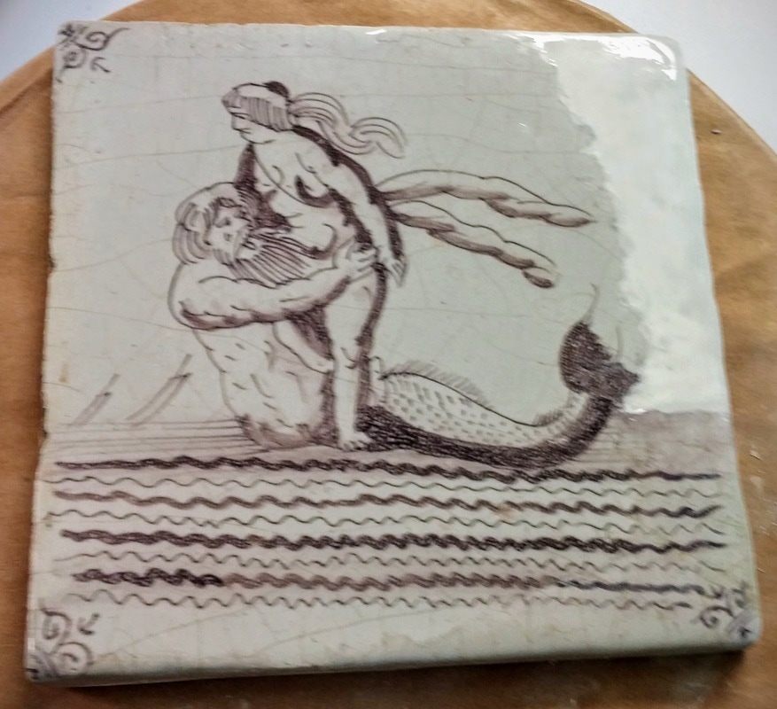 I should have started over ages ago! After months of struggle, the tile is finally finished. The crazing lines and my reconstruction of the tile's original decoration blend in well.
Thanks for checking back! Be sure to check Twitter for updates under #WeirdTileoftheDay and #WeirdTileWednesday. Tune in soon as I delve into my struggle to find where the tiles came from! For more information see:
Photos by author unless otherwise stated.
1 Comment
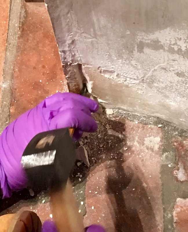
Most if not all of the Delft-tiled fireplaces at Winterthur are probably not original to the house. The Museum's Registration Department holds copies of Henry Francis du Pont's daybooks, journals where he meticulously recorded each and every antique and piece of art that he purchased. By comparing entries in his daybook to receipts from antique dealers, I can hypothesize that du Pont bought all of the tiles in his collection sometime between 1920 and 1940. These dates also correspond to when many of the rooms in the house with tiled fireplaces were installed. 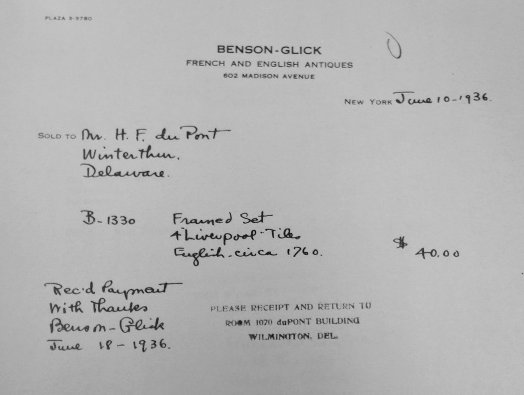 Bill of sale for 4 Liverpool Delft tiles from 1936. Unfortunately most of the descriptions in the daybooks and receipts are vague, making it hard to find provenience. Tiles are traditionally attached to fireplaces using a combination of a mortar (a thin sort of cement) and lime plaster. However, when the Winterthur tiled fireplaces were installed from the late 1920s to the early 1940s, builders bypassed the mortar, instead using gypsum plaster and a creative variety of "modern" materials. Portland Cement Tiles installed with Portland Cement in the Bertrand Room. The rather culturally insensitive Chinoiserie tiles from the 1750s in the Bertrand Room were installed using Portland cement in the 1930s. According to tile expert, Lesley Durbin of The Jackfield Conservation Studio, Portland cement is an inappropriate material to install Delft tiles. By their composition, tin-glazed earthenwares like Delft tiles are susceptible to the efflorescence of soluble salts. Soluble salts are normally held in the ceramic body, but when exposed to high humidity, they crystalize on the surface, damaging tiles and causing glaze to spall off. Portland cement also is much harder than tin-glazed ceramics, making the prospect of ever removing tiles from this fireplace daunting. Duco Cement? The tiles in the Patuxent fireplace surround were probably attached with DUCO® cement is a fast-drying, cellulose nitrate-based commercial cement. When viewed under long wave ultraviolet light, the grout and mortar fluoresce a light greenish yellow, a classic indicator of cellulose nitrate. The adhesive tends to discolor overtime, giving the grout between these tiles a dark brown stained color. Mysterious Surprises... The front of this innocuous-looking tile masks a mysterious secret. When flipped over....  ...whatever this is is revealed. This tile is in storage at Winterthur-- not mounted in a fireplace--but this tile was too crazy to not include in this post. It was coated in a cellulose nitrate adhesive, then a black resin, and finally 16 adhesive tabs were attached over top--all of which retain their plastic barrier layers. Why and when this was applied remains a mystery... Exploratory Excavation of Vauxhall Fireplace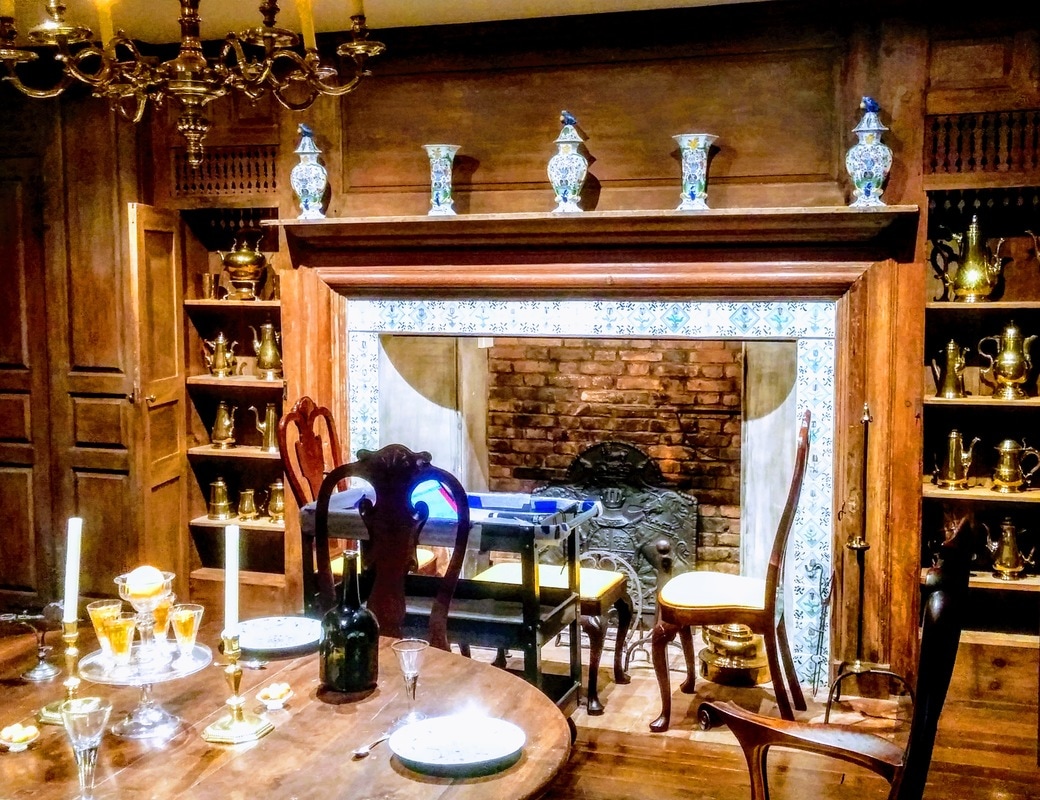 Since building records are eluding me at present, the only way to definitively know how the fireplaces were constructed is to perform exploratory excavations. Vauxhall fireplace on the fourth floor of the museum was damaged in a flood in the 1980s. While it appears structurally stable, the plaster surrounds are powdery and delaminating (below, left). The tiles show evidence of soluble salt damage such as cracking and spalling (below, right). Chemical spot tests reveal that sulphates, common in gypsum plaster (hydrated calcium sulphate, CaSO4•H2O), are the probable culprit. Part of my fellowship project may include dismantling the tiles in Vauxhall fireplace. This would allow me to treat the tiles in the conservation lab (much more ergonomic working conditions as you shall see). In order to conclusively determine how the tiles were mounted in the fireplace, my supervisor, Associate Objects Conservator and Assistant Affiliated Professor, Lauren Fair and I decided to remove one tile from the lower proper right corner of the fireplace. 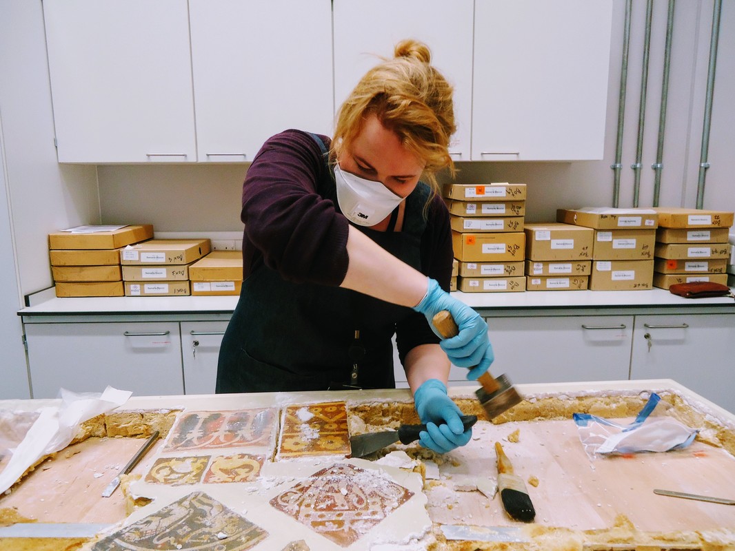 During my internship year, I participated in a project at the British Museum removing Medieval floor tiles from a panel (above). Based on my experience, Lauren and I decided that using a hammer and chisel was the best course of action to remove tiles from the Vauxhall fireplace. After a two-hour delay due to snow, we began the removal process! To protect ourselves from the plaster dust and chips, we wore dust masks, protective goggles, and nitrile gloves and vacuumed dust and debris as we went to minimize disruption to the rest of the objects in the room. To remove the tile, we decided to cut a channel behind the lower tile using a stone-carving hammer and chisel. This was accomplished by sitting or lying on the floor and crouching to strike the plaster at the proper height. Because the tiles are so tightly stacked, the only way to access the tile was from the proper left side. When we finally chipped most of the plaster away, we realized that the tile above had also become detached. To Deinstall or not to Deinstall...When the tiles were removed, we could clearly see that the fireplace had been constructed of brick covered in about an inch of plaster (above, center). The tiles were directly stuck into the plaster without a barrier to protect them from the movement of soluble salts. We still haven't decided whether or not we're going to remove all of the tiles to conserve them. A further consideration of the risks and rewards of deinstall needs to be undertaken. Stay tuned! Thanks for checking back! Be sure to check Twitter for updates under #WeirdTileoftheDay and #WeirdTileWednesday. Tune in on March 15th as I delve into my struggle to find where the tiles came from!  For more information see:
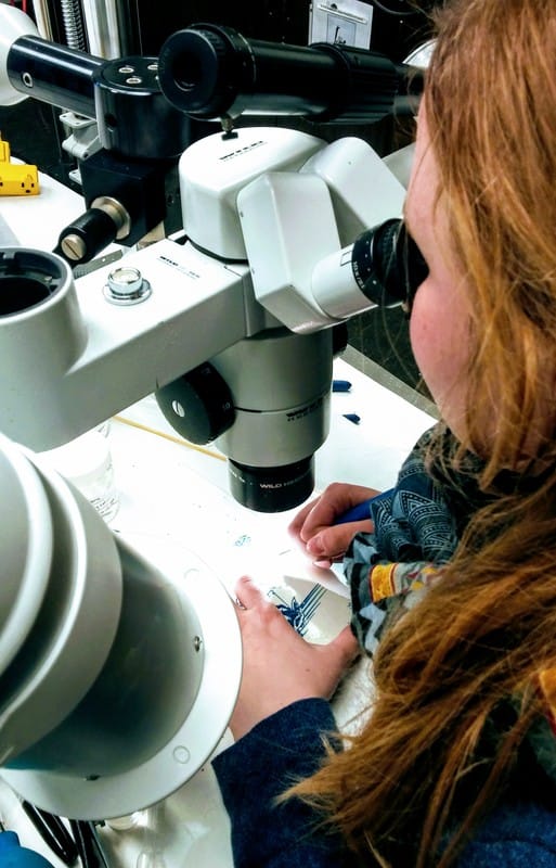
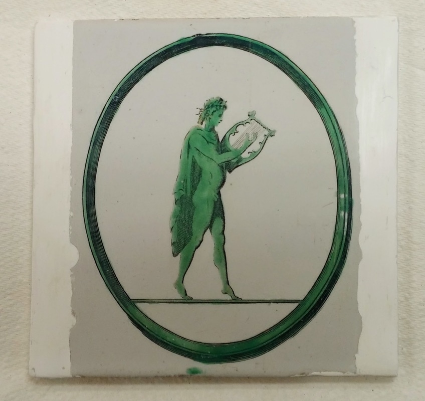
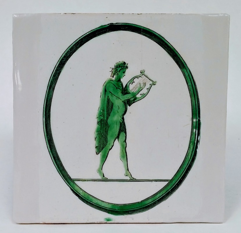
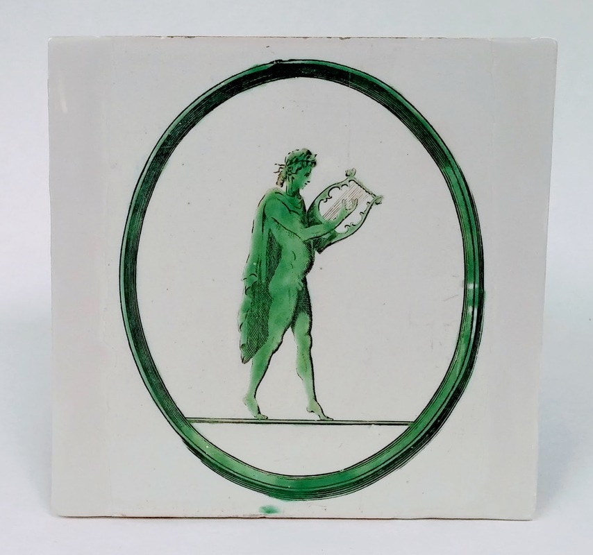
Durbin, Lesley. 18th Century Delft Tiles: English and Dutch Tin Glazed Tiles Circa 1650-1790. http://www.jackfieldconservation.co.uk/18th-century-delft-tiles/ Photos by author unless otherwise stated. What is Inpainting?When we left off last month, 1969.4732.012 had been filled with Flügger and was ready to be painted. 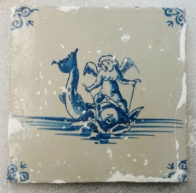 Before inpainting. But filling is not the hard part--especially on a flat object! The challenge comes when you try to inpaint, or match the color of the surrounding original material. The theory of inpainting is that the color of the filled area should not attract the viewer's eye like a white fill would (below, left). Generally with archaeological material from the British Museum, inpainting takes the form of toning the color of a fill to a neutral tone (below, center and right). Sometimes this backfires as in the case of a fill done on the Elgin Amphora before it came into the British Museum's collection. The bright, orange "neutral" tone draws the eye to the fill rather than the original material (below, center). In decorative arts collections like those at Winterthur, if the design is repeated or if other examples exist, it is sometimes replicated. The curator and I decided to go for a decorative arts approach to the tiles. They do not have any known provenience and many of their designs are well-documented. Their main significance in the collection is an aesthetic one. 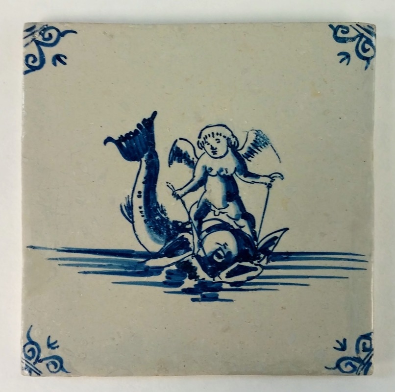 After inpainting. Inpainting should never cover any of the original material. When it does, it is called overpainting. Some restorers in the past painted over the original material in order to create a seamless color. This can have disastrous results when the paint ages poorly (see below). The red rectangles indicate the area of the tile that has been filled. The person who originally restored this tile painted over the fills and onto the glazed surface of the tile. At one time, this probably blended in very well. However, the cellulosic paint has discolored. As you will see, modern conservators use of inpainting can be almost as effective as overpainting at restoring the aesthetic integrity of works of art--but in a much more ethical and controlled way. 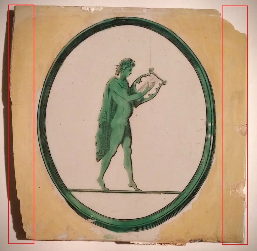 Historic fills and overpaint have aged poorly. The fills are made of a brittle epoxy material and the paint has discolored and is flaking. Both the fills and the paint will be removed. 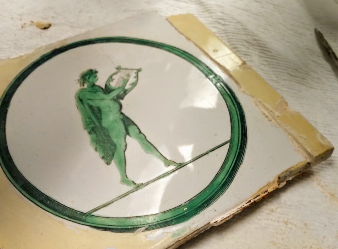 Removing some of the paint with a scalpel under a microscope to expose the filled area (right, yellow) and original white area. Pigments, Media, and Other MaterialsSome conservators prefer inpainting with dry, ground pigments, like this beautiful (and functional) display in the Winterthur Objects Conservation Lab. These are finely ground and applied to fills in a medium, such as Primal WS-24 or Golden Acrylics Porcelain Restoration Glaze. 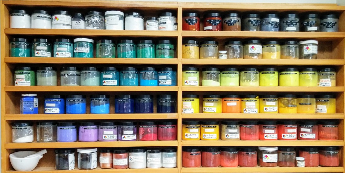 Dry ground pigments, Winterthur Objects Lab. I've only really used them to make epoxy color fills for porcelain. These fills are very permanent so any guesswork with matching the color is best avoided. 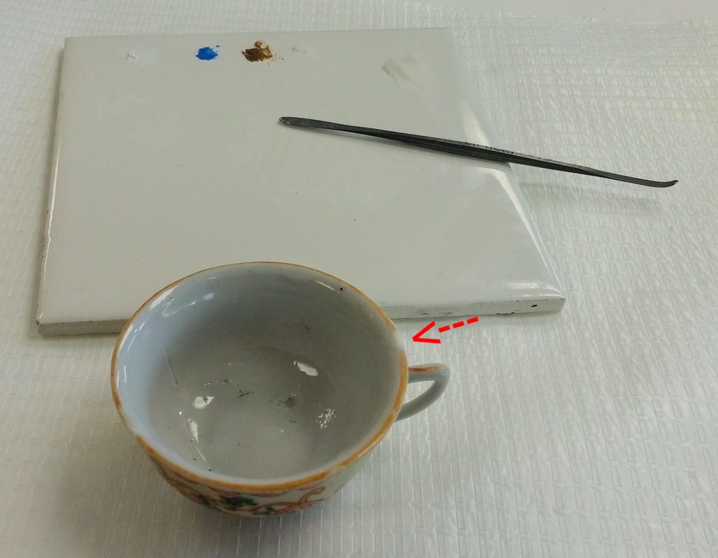 Epoxy color fills (red arrow) are most often used on porcelain as they allow conservators to match the color and translucency of porcelain. Sometimes conservators opt not to use them at all because of their irreversibility and tendency to yellow with age. I personally prefer using Golden Acrylic paints, because they are what I'm most familiar with. A major disadvantage of working with acrylic paint is that it dries slightly darker. This is especially challenging when trying to exactly match the color of a large area of fill! 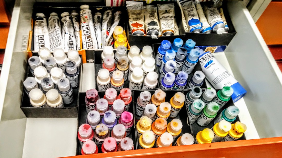 The last crucial materials for inpainting are the proper brushes (I especially like sable). I like using a Size 4 round brush and a 1/8" flat brush (a) for large areas of fill (as large as then can be on a 5 x 5 inch tile). Sizes 1 and 00 or 000 brushes are great for smaller fills or inpainting detailed designs (b). Brush (c) is a cheap Size 1 synthetic brush that I destroyed. It's great for replicating the spots and imperfections of a surface. 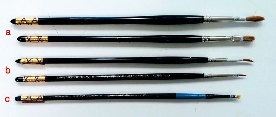 Inpainting Dutch and English Delft tiles For the two tiles I will present, I've been experimenting with a mix of acrylic paints and Primal WS-24, an acrylic dispersion. When dried, Primal has a hard, clear, glaze-like appearance. It can also be sanded with MicroMesh, fine-grade sandpaper to make the surface even more even. 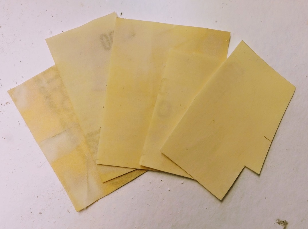 MicroMesh fine-grade sandpaper in grits 1500-12000 (left to right). Sometimes the conservation gods allow you to color match on the first try. This 17th century Dutch tile only took an hour to inpaint. But this is hardly the norm. Sometimes it takes hours and hours to get it right. If you were asked what color the English Delft tile below is, you would probably say white, right? In theory, yes. But when compared with the bright white of the detachable plaster fills (below, right), it appears much more gray. Matching this color involved mixing 8 different colors of paint including: Titan Buff, Titanium White, Paynes Gray, Cobalt Blue, Hansa Yellow Light, Yellow Ochre, Alizarin Crimson, and Raw Umber. As per advice from my high school paintings teacher (thanks Ms. Mortl!), I never use black paint. I added the different colors in very small amounts to Primal to match the tin-glaze. This process takes the longest--especially for such a large area of fill. The slightest difference in color will really stand out and distract the viewer. 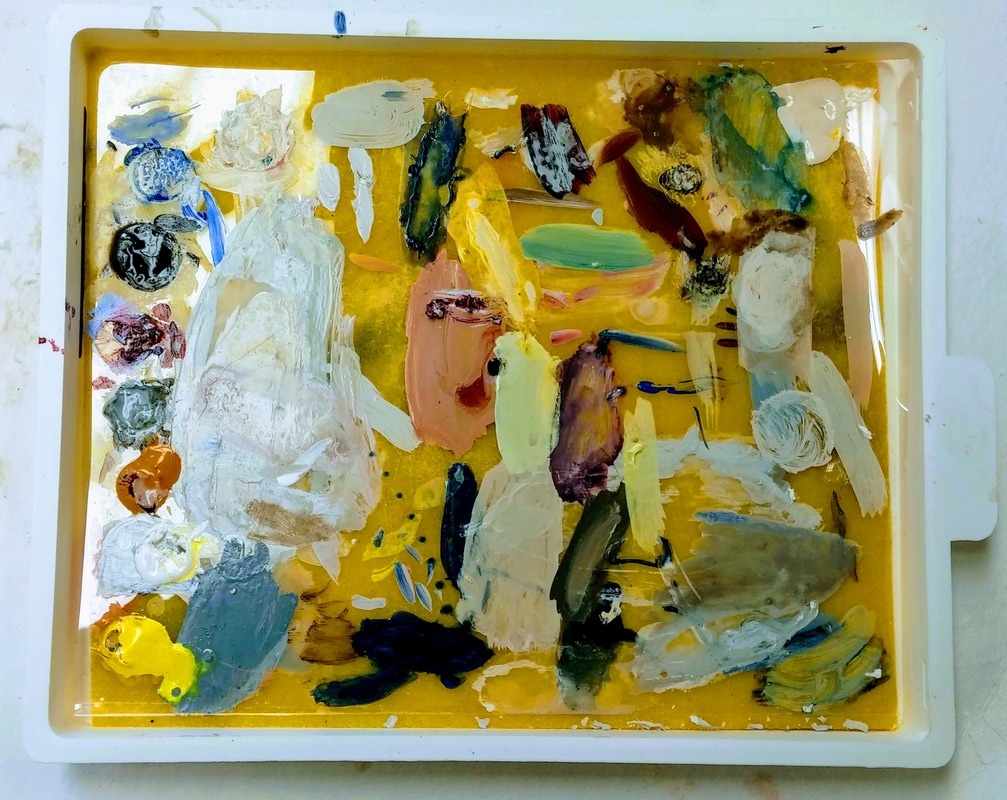 The lovely yellow sponge of my Sta-wet Palette keeps acrylic paints fresh over many days of work. Once the correct color is made (after many many many attempts), it was applied to the fills and allowed to dry for a week. The paint layers had dried differently, leaving a slightly raised and uneven surface. You can see in the photo on the left that this caused the fills to appear darker. To remedy this, I polished the painted surfaces with grades of MicroMesh up to 12000. This gave the tile a seamless surface, allowing the tile to be seen as it once would have looked, while allowing careful observers to see that it had been filled. Thanks for checking back! Be sure to check Twitter for updates under #WeirdTileoftheDay and #WeirdTileWednesday. Tune in in two weeks as I discuss how tiles were once mounted in fireplaces!
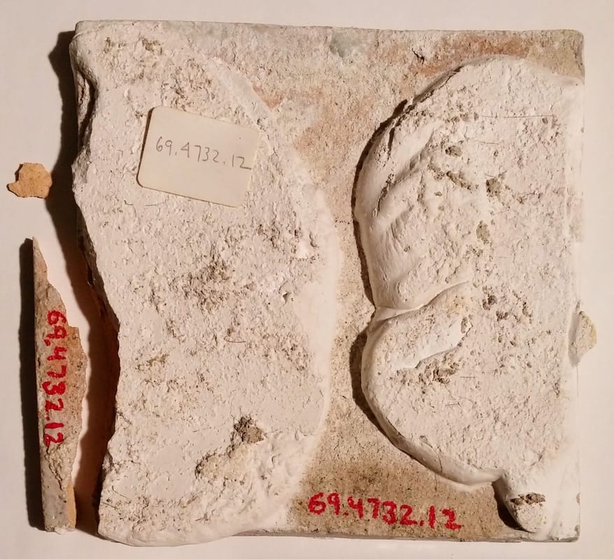
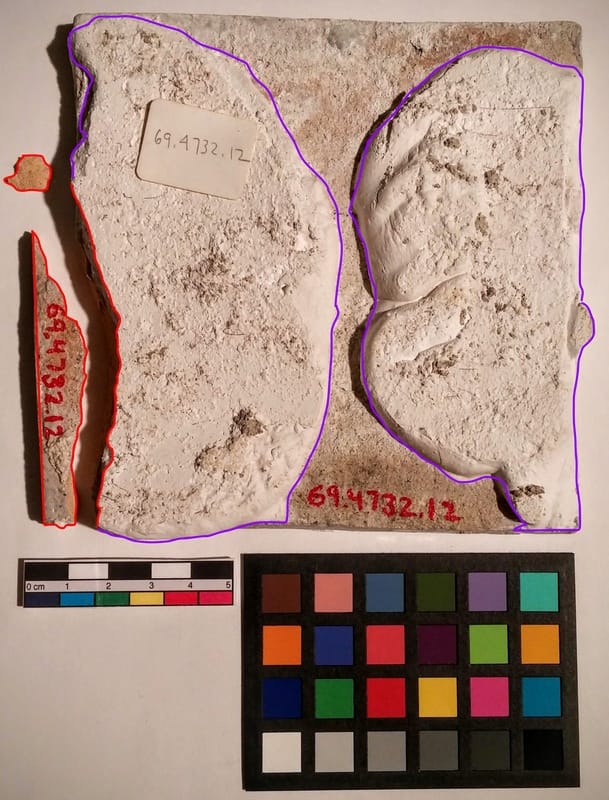
 This post will be a bit shorter than the others because of the holidays! However, I wanted to share an update on the progress of the treatment of 1969.4732.012., one of the tiles from the "sea monster" set. This tile and others decorated with various "sea monsters" were once part of the fireplace in the "New York Bedroom" at Winterthur. However, the room and the fireplace were both de-installed in the 1960s. The tiles were removed, but huge remnants of plaster (outlined in purple, below) were left on the backs of the tiles. Areas on the front surface of the tile had chipped off and become lost (outlined in red, below).
Prior to starting any conservation work, I consulted Senior Curator of Ceramics and Glass Leslie Grigsby to discuss treatment goals for this tile. These included: removing the plaster mounting material, removing yellowing fills and replacing them, and in-filling chips in the glaze to restore aesthetic integrity to the tile. Picking away at PlasterAfter testing a variety of methods, I determined that the easiest way to remove the thick plaster (2 cm in areas!) was to create channels in it using a small file. I then could chip sections away using a scalpel. This work was done under an elephant trunk, or extractor, to reduce the amount of dust in the air while I was working. I also wore a surgical mask to prevent breathing in fine plaster dust. As you can see below, this is messy work! 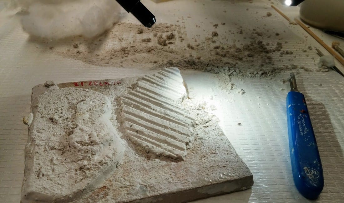 Channels have been cut, in the process of removing sections with a scalpel. 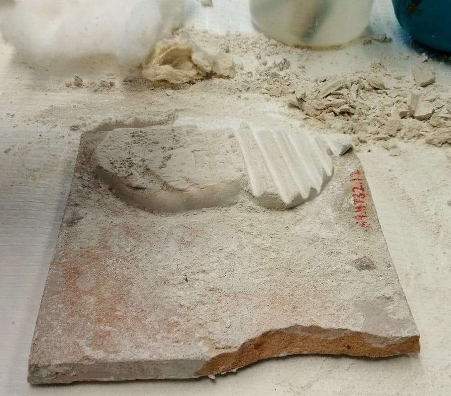 Side one has been removed. Channels are being cut into the other plaster lump. 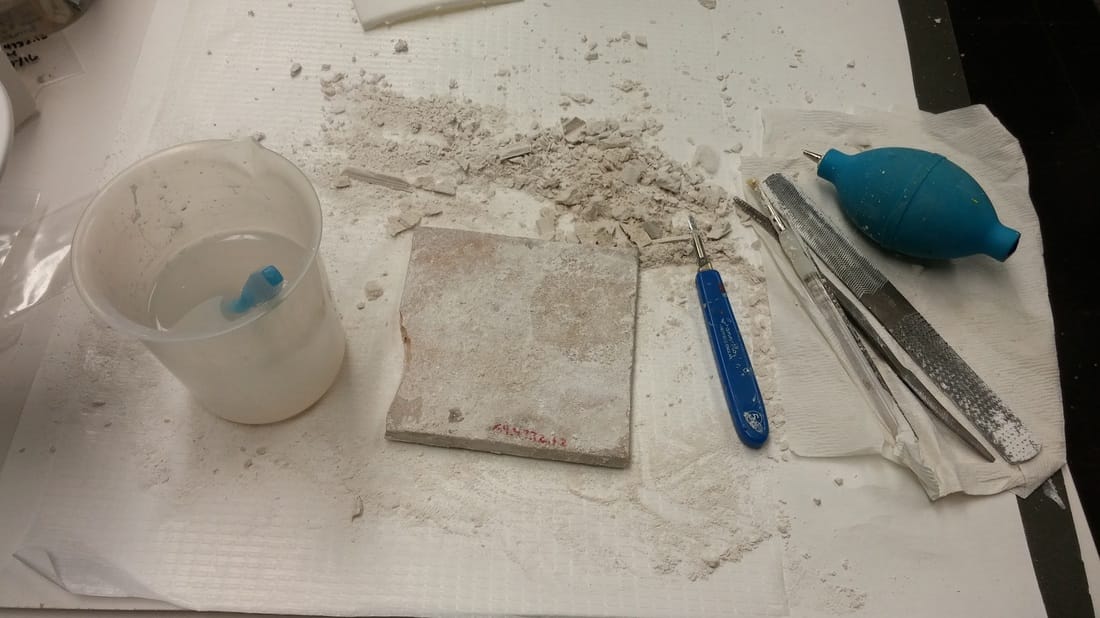 Tile with plaster mounting material removed, tools of the trade from left: water and brush, scalpel, various files, and an air puffer to remove plaster dust. Voila! Removing the FIllsA historic restorer had used an epoxy covered in yellowed paint to fill chips in the edges of the tile (below, left). This adhesive had turned dark brown and was brittle and flaking (below, middle). I removed it by softening it in acetone and using a scalpel to pick it off (below, right). After coating the chipped areas with an acrylic adhesive to protect the underlying ceramic, I began filling the missing chips using Flügger, a conservation-grade acrylic spackle (and my absolute favorite thing). 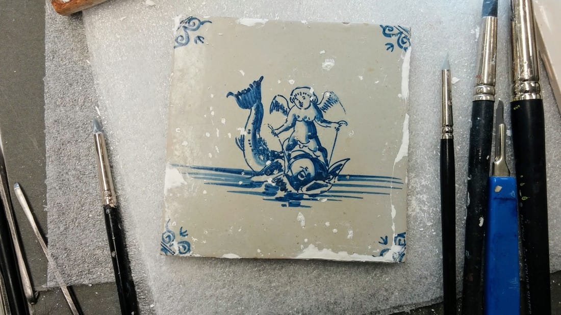 After sanding and perfecting my fills, I will in-paint them with acrylic paints to match the surrounding glaze. This color is proving tricky to replicate as it contains small flecks of brown, gray, yellow, red, and blue rather than being one solid color. Stay tuned! Thanks for checking back! Be sure to check Twitter for updates under #WeirdTileoftheDay and #WeirdTileWednesday. Tune in January 18th to explore an incredibly brief history of western fireplaces. 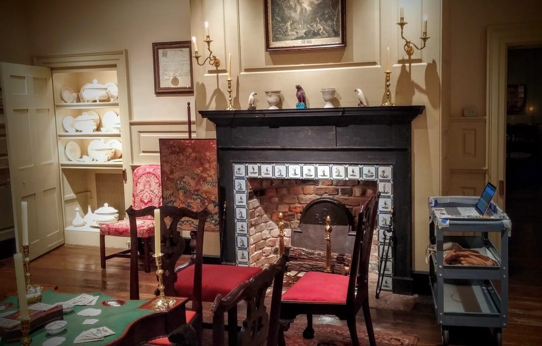 The Bertrand Room at Winterthur, decorated in the Chippendale Style (c. 1760). |
Madeline HagermanWinterthur Postgraduate Fellowship in Objects Conservation Archives
July 2018
Categories
All
|
 RSS Feed
